Aquarium of the Pacific
Bringing together passionate users and the aquarium to contribute to sustainability initiatives.
![[removal.ai]_tmp-62cc933356605_VLJ673.png](https://static.wixstatic.com/media/05d2d5_3e246ccb287b43408d64bed4b294d041~mv2.png/v1/fill/w_716,h_460,al_c,q_85,usm_0.66_1.00_0.01,enc_avif,quality_auto/%5Bremoval_ai%5D_tmp-62cc933356605_VLJ673.png)
Project Overview:
Design Challenge: Aquarium of the Pacific is a renowned aquarium with a website full of educational resources on numerous marine life topics. However, the aquarium had a vision for users to learn more about sustainability efforts on their website, specifically focused on plastic waste. They also wanted to utilize their site to increase user involvement in community conservation events. Our design challenge was to create an intuitive redesign of their website to drive user involvement towards each of these sustainability efforts.
Duration: 2 weeks
Team: 2 designers
My role: UX/UI Designer
Tools: Figma, Trello, Optimal Workshop, Otter.ai
Methods: User Interviews, Card Sorting, Heuristics Analysis, Persona, User Flow, Sketches, Wireframes, Usability Testing, High Fidelity Prototype
Research: What’s stopping users from getting
involved in conservation efforts?
Research and Synthesis Methods: User Interviews, Usability Testing, Affinity Mapping, Card Sorting, Heuristics Analysis
Initial Usability Testing Tasks
(Discovery Phase): 4 Users
Involve Users:
We found it effective to involve users in both usability tests and interviews from the very beginning to end of our entire project. Gaining direct insight and observing how users moved through the website gave us beneficial data to discover user pain points.

Users Interviews and Affinity Mapping Insights:
Insight: Global Navigation is not organized
Users couldn't find what they were looking for or made errors in their search since navigation was not organized in the way they expected. This caused them to have more errors, a slower completion rate of tasks, and a more difficult and frustrating experience using the website.


Insight: Conservation topics are not shown anywhere on the homepage
Even if users knew this information was on the site, they were still unable to find it as it was not listed anywhere in the global navigation bar or on the homepage. This caused 50% of users to give up on the task of finding plastic waste learning resources altogether.

Aquarium of the Pacific homepage before our redesign.
Heuristics Analysis Insights: Learnability, Efficiency, Error Management
Learnability
The website was not organized in a way that is intuitive. It was a guessing game to learn where everything is on the site. Also, the topics such as Conservation Events and Plastic Waste were not listed anywhere in the navigation menu or on the homepage, which made it difficult to learn how to find that information on the site.
Efficiency
We also discovered that there are many unnecessary steps involved in reaching users’ goals. While conducting the heuristics analysis, it took 5 different steps on the website to come to a long, unorganized list of resources regarding sustainability that took a long time to browse through.
Error Management
Many errors were made while trying to use the navigation bar to find the information that would lead to the resources for Plastic Waste and Conservation Events. A lot of trial and error was done until the information was finally found.
User Persona : Meet Laura the Learner!
Through our user research and synthesis we were able to create a user persona. Meet Laura the Learner!
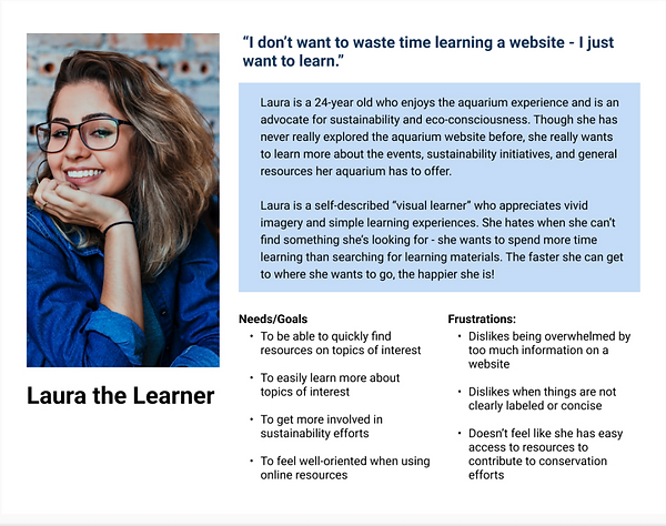
The Problem: Resources are almost impossible to find.
Without promotions for sustainability efforts on the Aquarium of the Pacific website, as well as its absence from the navigation bar, it is almost impossible for users to find any sustainability information they are looking for, if they even know it exists. If that information is found, it takes multiple steps that are inconvenient and discouraging. Problem Statement: Our persona, (Laura the Learner) needs an efficient way to find sustainability and educational resources on the site so that they can easily learn more and participate in sustainability efforts.
The Solution: Increase Visibility and Efficiency of Navigation
We believe that if we implement a filter in the resource pages and reorganize navigation of the site, then we are likely to increase user interaction, eliminate errors, and decrease the time it takes for users to learn more about topics of interest and get involved with aquarium initiatives.
Initial Sketches:

Our initial solution was to add an entire new tab called "Sustainability and Learning", with a landing page where users could click on two different card categories: Conservation Events and Learning Resources. After discussing the usability of this idea with my teammate, we decided to conduct a card sort to validate the design decision.
Card Sorting Insights: Going back to the User Expectations
Because there were tabs already dedicated to learning and events, users found it most effective to find each resource there. This prompted us to add a Plastic Waste Learning landing page to the "Learn" tab of the website and a Conservation Events landing page to the "Events" tab.
Learn
Events

Final Sketches: Landing Pages and Promotions


For both the Plastic Waste Learning and Conservation Events landing pages, users will be brought to a section to filter the material to decrease the steps to find what they are looking for.

We also sketched a promotional pop up to include throughout our learning resources articles, specifically about plastic waste so that users who were interested in both could easily find them quickly and in one place.
Key Features: Final with Iterations
Promotions

Our implementation of our Conservation Event promotions were placed as a banner displayed across the center of the site and a simple call to action button in the top right. Using a neon green color, users are able to easily view the promotion and click on either the banner or button to be taken to the Conservation Events landing page.
Reorganizing Navigation and Including Promotions
We ensured that users would be able to find the educational resources they needed through the navigation bar.

In the Learn tab, we included a Plastic Waste Resources landing page.
We further promoted Conservation Events throughout the site by including a spotlight within each navigation bar to the far right.

In the Events tab, we included a Conservation Events landing page.
These implementations made it easy and efficient for users to find exactly what they were looking for on the site in order to get involved in sustainability.
Filters on Conservation Events Landing Page

Once users click on Conservation Events in the Events tab, they will be brought to the Conservation Events landing page. Here, they can filter by topic, as well as see a quick-view description of each event before deciding to click on the page. This saves a lot of time for the user and eliminates any extra unnecessary steps.
Sign Up Page and Iterations
Before Final Design

Once users decide on an event, they will be brought to an events details and sign-up page. On our initial Events Details page, we placed the sign-up section at the top of the page. However, in our usability testing, users mentioned that they would like to see more event details, such as date and time, at the top of the page before being given the option to sign up. They also wanted an easier way to scan the events details rather than reading a long page of information.
Iteration and Final Design
We iterated our design based on user feedback by bringing the date and time information to the top of the page, adding headings to event detail topics, and moving the sign up option to the bottom of the page. This way, the user can easily find all of the information they need before deciding to sign up for the event.

Filters on Plastic Waste Landing Page


On our Plastic Waste Educational Resources landing page, users are able to easily filter by resource type. This leads them to a more condensed list where they can quickly scan the descriptions of each resource before deciding to read. For example, if you Select and Apply "Articles and Tips," you will be brought to a new screen with Articles and Tips resources on plastic waste.
Conservation Events Pop-Up

With the use of a Conservation Events pop up promotion, users are able to learn and get involved in sustainability within one step. For example, after users educate themselves on plastic waste, they can easily find and sign up for a conservation event through the pop up on the same page.
User Flow: Completing two tasks in less steps
Below is a user flow visualizing the steps the user would take to find and read an article on plastic waste, and then utilize the pop up feature to find and sign up for a conservation event (without needing to use the navigation bar).

Usability Testing Results: Quicker Completion Time and Elimination of Errors


The Result: Business Goals Were Met and User Problems Were Solved
Through our redesign, we:
-
Reorganized the navigation bar
-
Added promotions and pop ups throughout the site
-
Implemented a filter system to access sustainability resources
These changes eliminated user errors, made the aquarium's sustainability initiatives more visible, and decreased the time it took users to find sustainability resources. This will in turn give users an easier and more efficient experience on the site, allowing more users to get involved in sustainability efforts and achieve the aquarium's business goals.
Reflection: Simple can be the most effective and always focus on user needs.
A simple change can go a long way. Without making drastic changes to the website, we were able to help users solve their problem and the aquarium achieve their goals. It was rewarding to see our work come to life and make a real difference with these designs.
Also, this project was a great reminder to constantly focus on the user needs in the design process. The user needs may not always be what YOU think is the best design for them. Because we based our designs on the raw user research data, we were able to drastically improve the user experience and solve the user and business problems.
Project Teammate Recommendation:
"Andie is a powerhouse! I collaborated with Andie on a 2-week project as a General Assembly fellow - I was impressed by her motivation, proactivity, and communication skills. Andie's talents and dedication to user-empathy were welcome and instrumental to our project success. Even when things were daunting or difficult, Andie was adaptable and compassionate. I loved my experience working with Andie, and I know anyone looking to work with her will, too."-Mia Borchlewicz (UX Designer Teammate for the Aquarium of the Pacific website redesign)